
Senhelder Guitar Works, a Texas-based luthier dedicated to crafting high-end, playable works of art, entrusted me with developing their brand identity. Their vision was to create guitars that resonated not just on stage but also as stunning visual pieces, and they sought an identity to represent that.
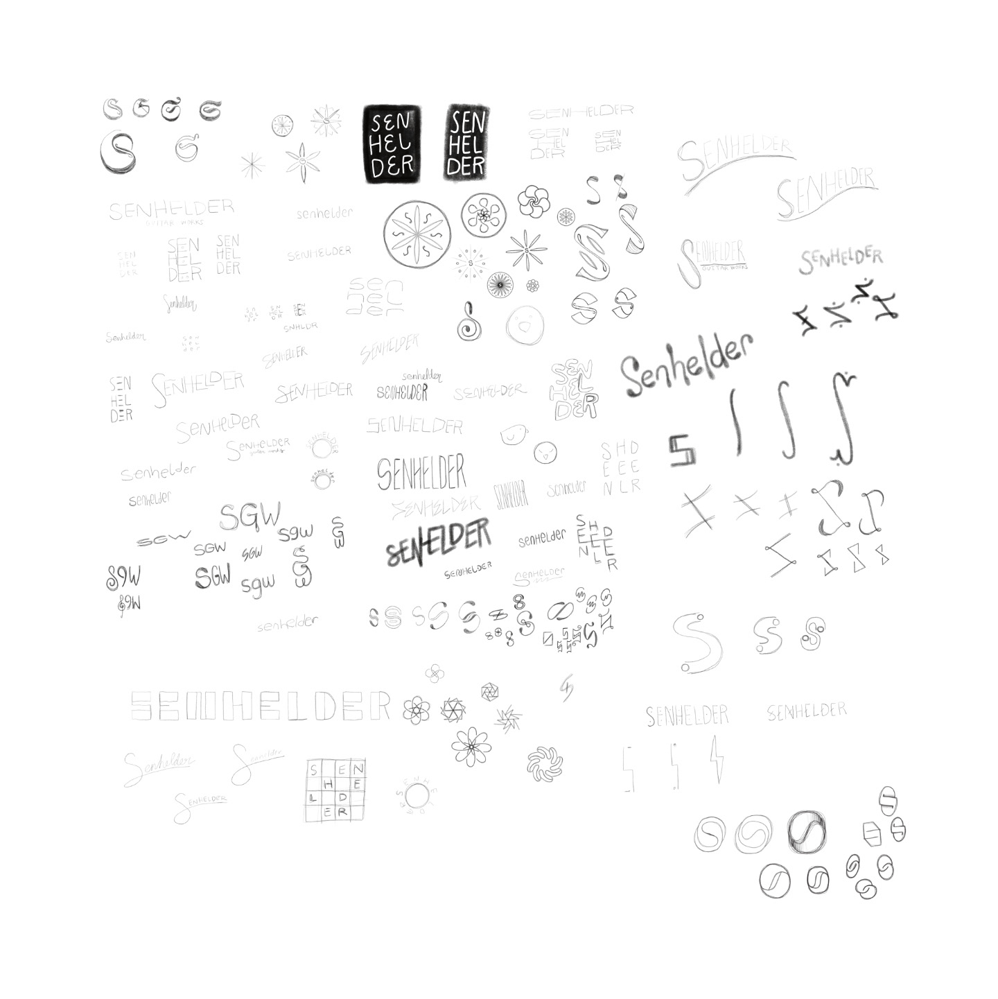
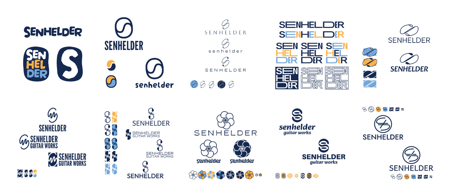
Drawing inspiration from the captivating sounds Senhelder instruments produce, I crafted a sophisticated and artistic visual language. The centerpiece of the brand identity is a unique lettermark. It combines a symmetrical letter "S" with a sound wave, symbolizing the equal balance of form and function. The subtle nod to a yin-yang symbol within the mark reinforces this concept of balance.
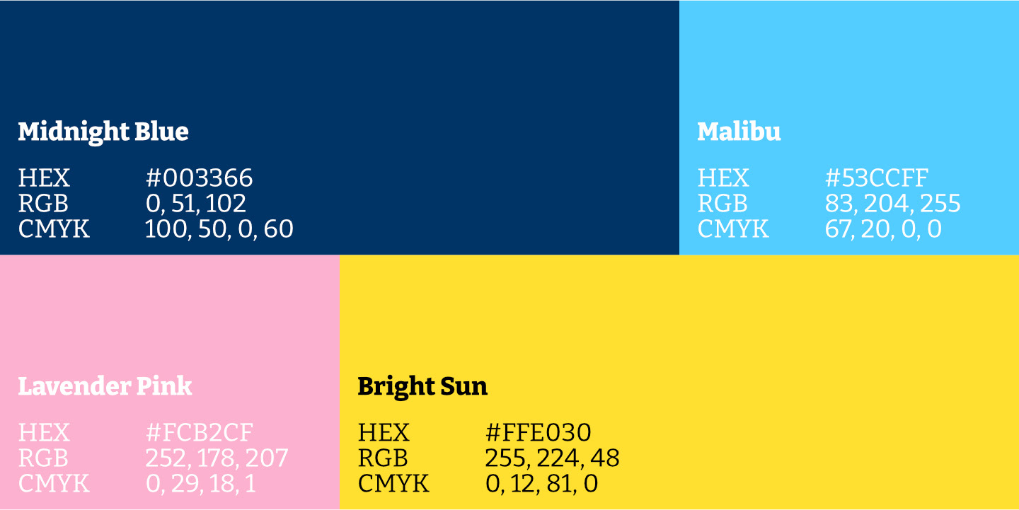
The color palette reflects Senhelder's philosophy. A deep blue evokes the night sky, while a sunny yellow represents the warmth of day, highlighting the versatility of Senhelder guitars—playable anytime, anywhere. Light blue accents nod to clear skies, and a touch of pink hints at the warmth of Texas sunsets, further solidifying the brand's local connection.
The project encompassed various touchpoints, including a logo, business cards, and marketing materials. Ensuring consistency across all elements, I established a clear style guide that outlined typography, color palettes, and image usage. This cohesive brand identity aims to elevate Senhelder Guitar Works' professional image and resonate with discerning guitar enthusiasts.